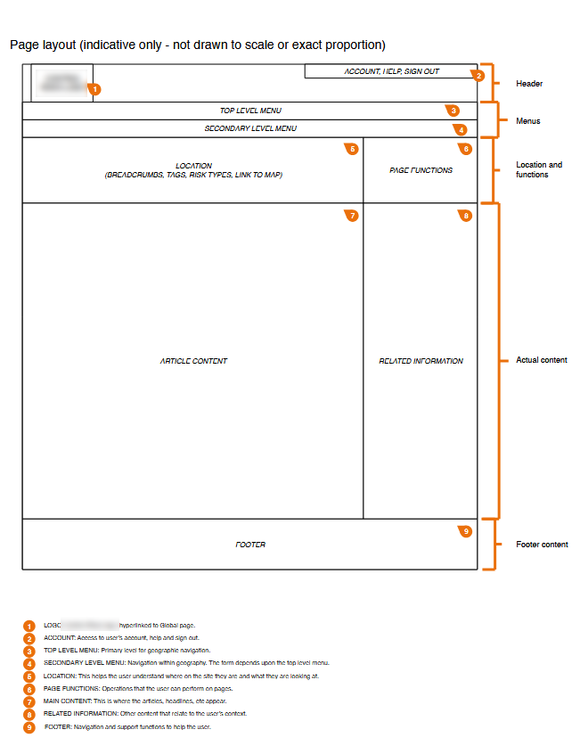
Product Design - User Research - UX Design - UI Design - Information Architecture - Sitemaps - User Journeys - Wireframes - Prototypes - HTML/CSS/JS - Analytics - Card Sorting - Surveys - Responsive Design
| Industry | Security |
|---|---|
| Skills | UX Design, UI Design, Information Architecture, Interaction Design |
| Tools | HTML/CSS/JS, Bootstrap, Visio, Omnigraffle, Excel, PowerPoint, Word, R |
| Example | This case study is anonymised and identifying details have been obscured. |
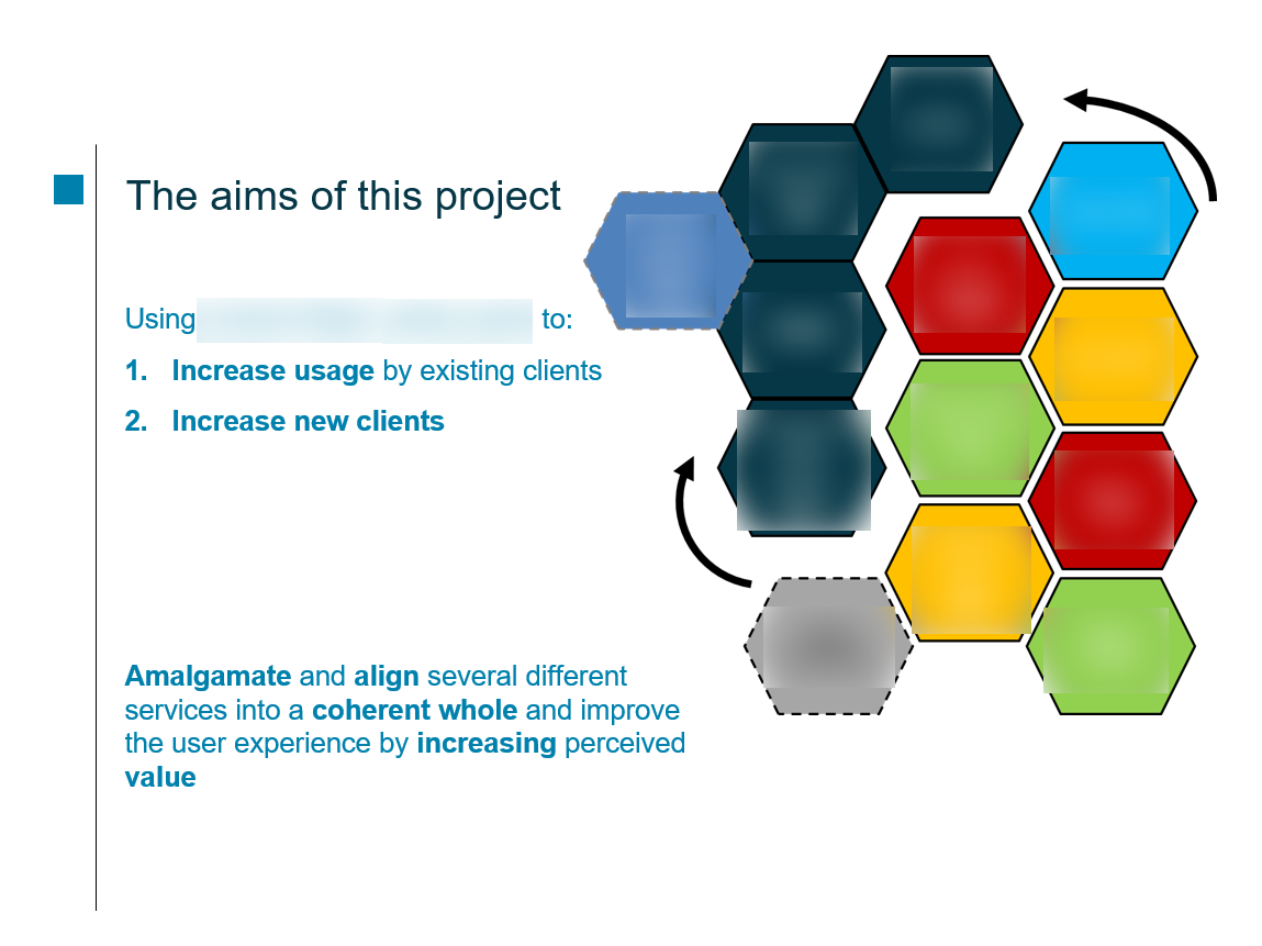
A global information consultancy (B2B) had multiple products providing bespoke news and expert analysis to industry. They had two questions:
Should products be merged? Either way, how to increase cross-sell and up-sell?
I was a last-ditch attempt after several false starts. I was also the only UX specialist.
This project required absolute precision. It was a major investment for the client and the business needs had to be clear, agreed and actionable for me to do productive work and make this project a success.
The business needs had to drive the business case (and, by definition, my work) so time was well spent clarifying them with senior stakeholders. With this knowledge, I created a workable plan to answer both key questions and provide strategic direction.
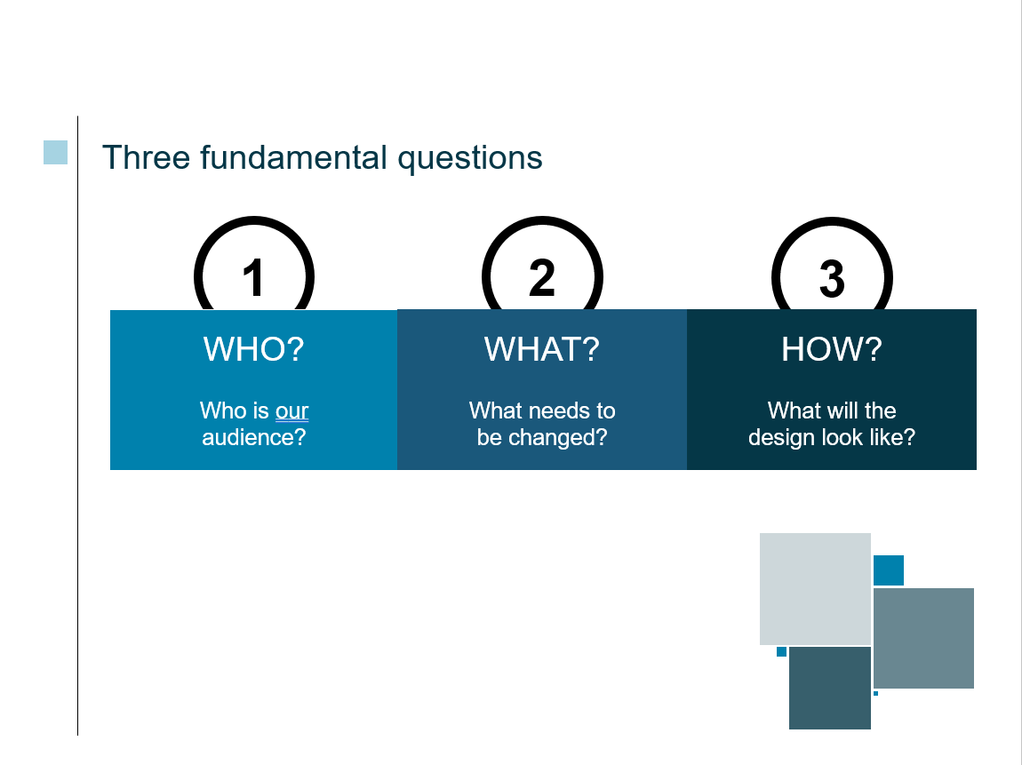
It was clear that there were, rather, three key questions:
Outcomes: As a professional who regularly turns visions into reality, I was comfortable with providing the right direction to the company but I still needed specialist knowledge of the business from the senior stakeholders. With careful negotiation, I was able to clarify their needs and then offer the client a positive path forward that mitigated risks and evidenced a solid business case.
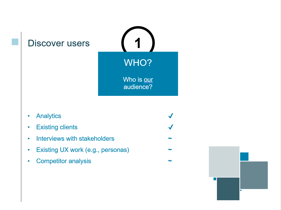
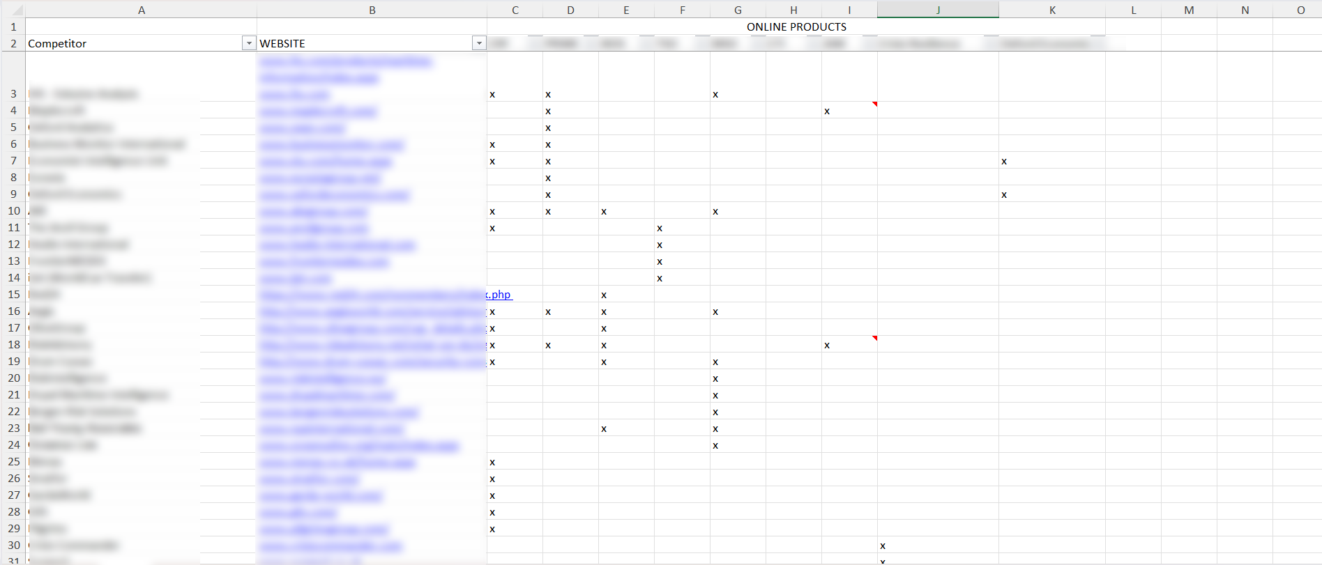
I examined almost 60 competitors against my client's products to gauge where they stood in the market. Measurements were derived from a set of criteria originating with senior stakeholders, and these criteria gave me further background to feed into user research.
Below shows a sample of the competitor analysis underway (anonymised). This was summarised in a report to the company's steering committee (not shown).
Outcomes: The company's data model was documented and ready for the next phase.
I began with a series of interviews of existing customers. The aim was understanding how they used this company's information (goals, barriers, etc) and topics were guided by existing desk research (from the content inventory, analytics, competitor analysis and stakeholder work).
Output was analysed for themes and, in turn, guided a survey issued to all existing customers. There was a specific strategic decision not to approach non-customers.
Outcomes: The interviews identified themes among customers and the survey put some strength and numbers on those themes. From this work, it was clear that there was an overwhelming appetite among customers to merge all products. The first question was answered and I also discovered that customers had little in common (low evidence of homogeneity). Their needs, goals, behaviours and barriers differed too drastically for consistency.
So let's merge these products!
But what does "merged" look like? We had the content already there but we had no idea as to what structure made sense to users. What did "navigable" and "findable" look like?
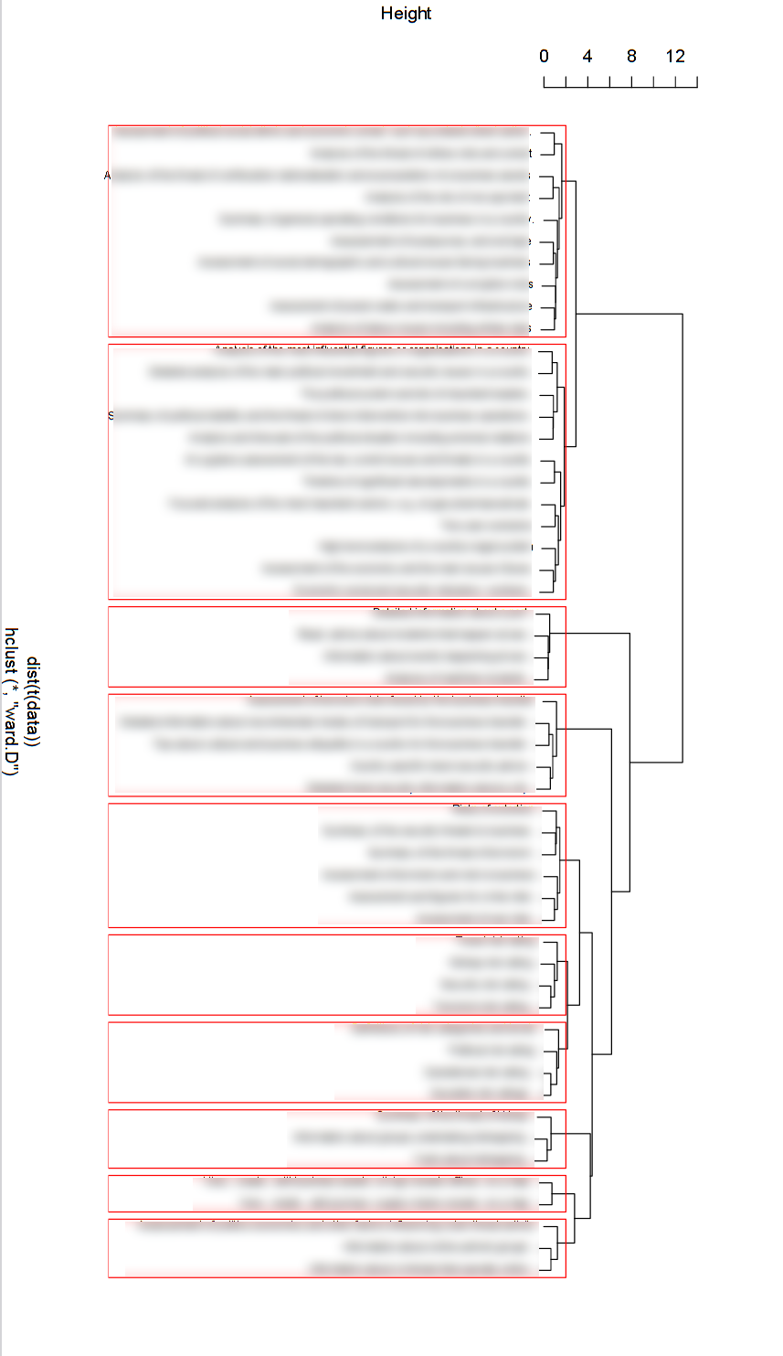
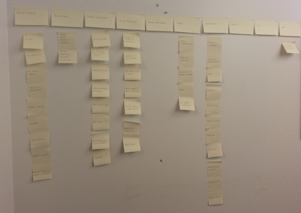
A card sort was organised using Optimal Workshop because customers were unable to attend locally. Separate card sorts were also issued across the company to both evangelise the activity and to compare and highlight company internal experience versus customer experience.
Below shows a video showing the clusters being examined interactively, a dendrogram with k-means cluster analysis, and a plot of a new information architecture / data model in a spreadsheet.
Outcomes: I got user data that enabled the next phase which was creating an information architecture to make information findable, navigable and sensible for users.
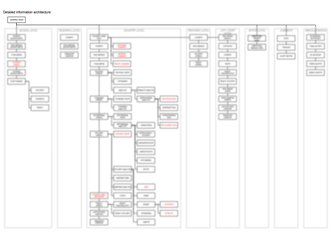
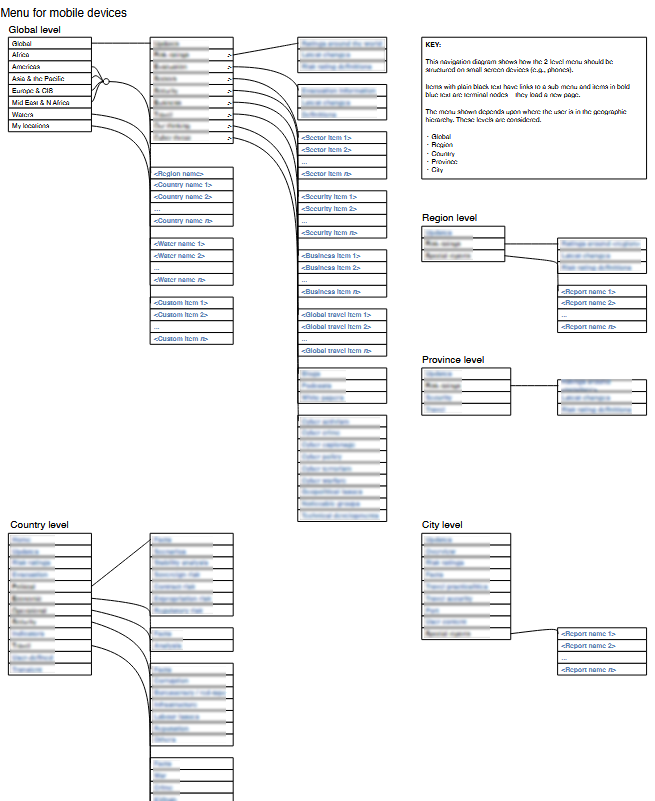
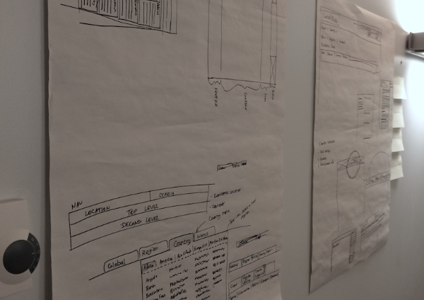
The key insight from all the work up to now was that a product-based information architecture was not good for users. After considerable thought and discussion, I eventually noticed that location was the way users looked for information.
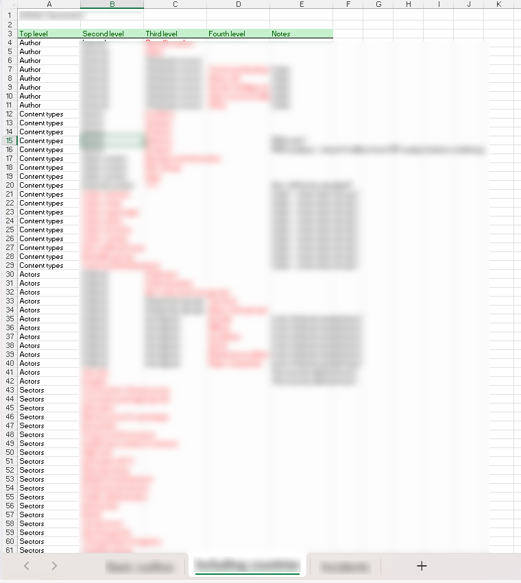
Using the card sort analysis data, I crafted a new sitemap (below). This merged products via geography and included navigation systems for desktop and mobile devices. Because of resource constraints, we were unable to do tree testing to validate it but I managed to get some guerrilla testing done on the fly for some feedback. The client felt confident the IA was workable because the research work until now had been of a very high quality and reliable.
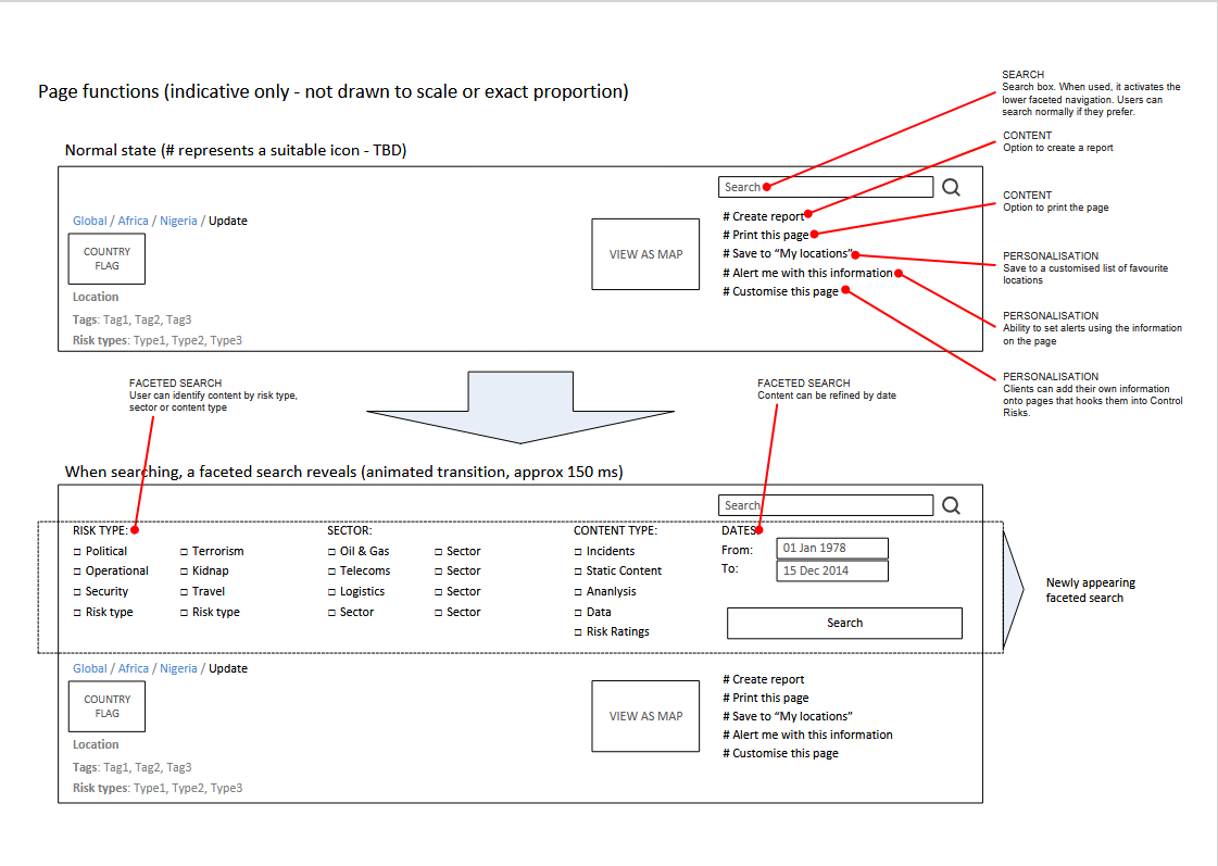
Increased functionality derived from user research was added. Because of the lack of consistency among users, capabilities for personalisation and customisation were also added.
Outcomes: I gained a structure that was understandable, navigable and complementary to users' needs of finding the information they needed, often in life-critical emergencies.
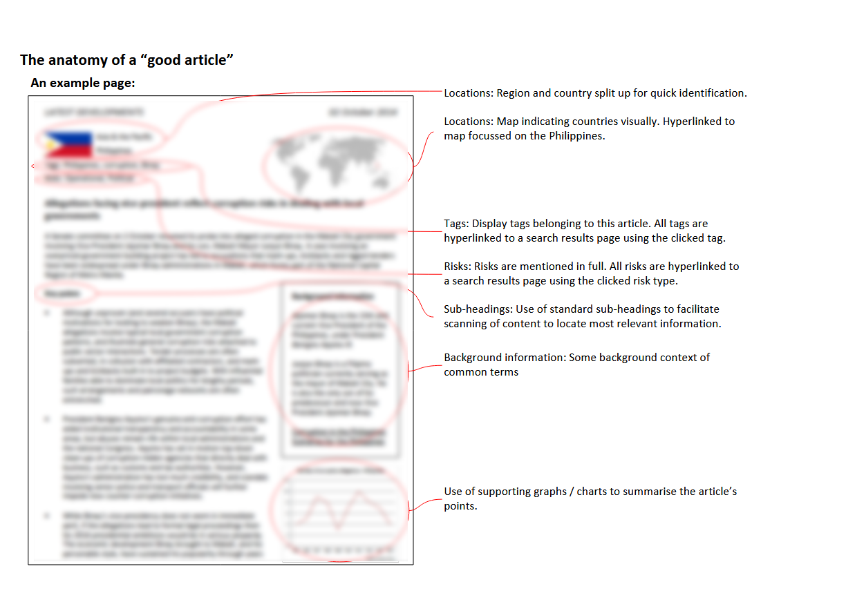
Of key value to users (and therefore the client) was the design of the template for individual articles. This was "terminal-node" (i.e., ultimate information goal) information that represented the most value to customers so extra work was required to ensure they met requirements.
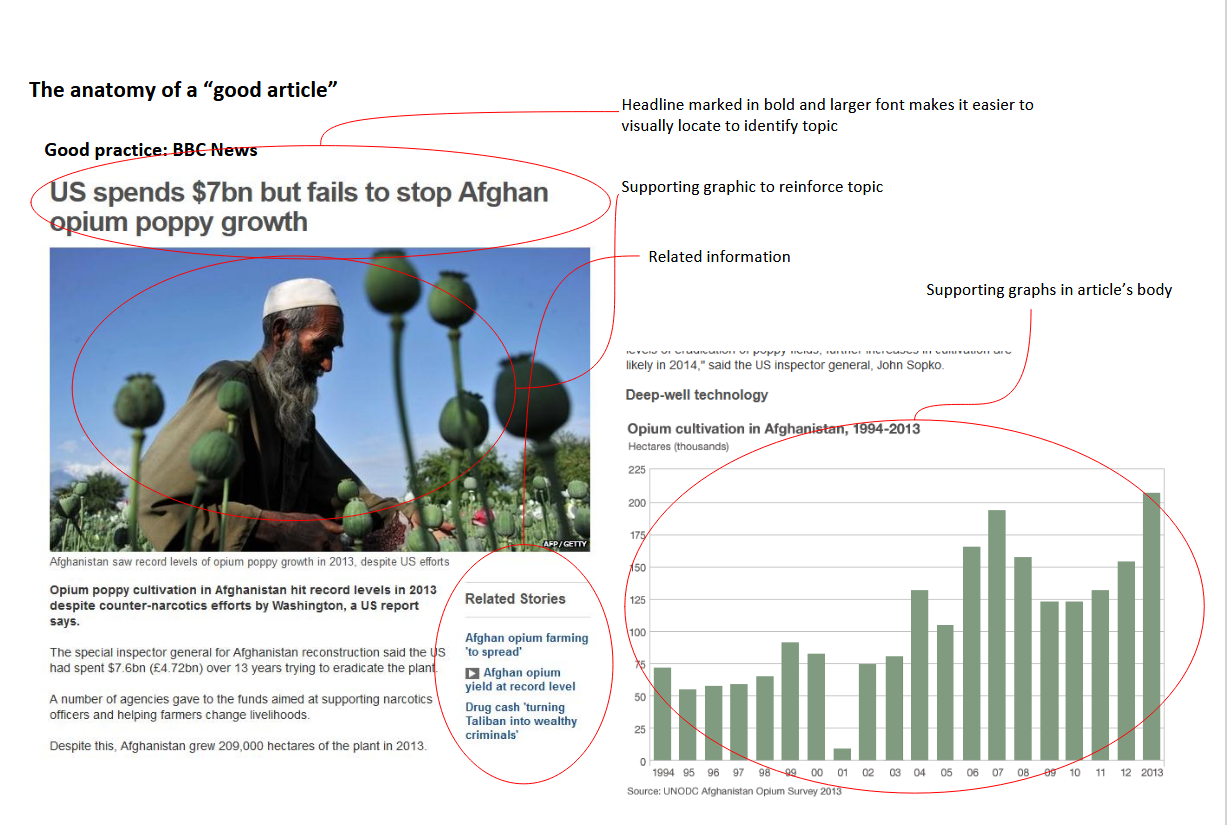
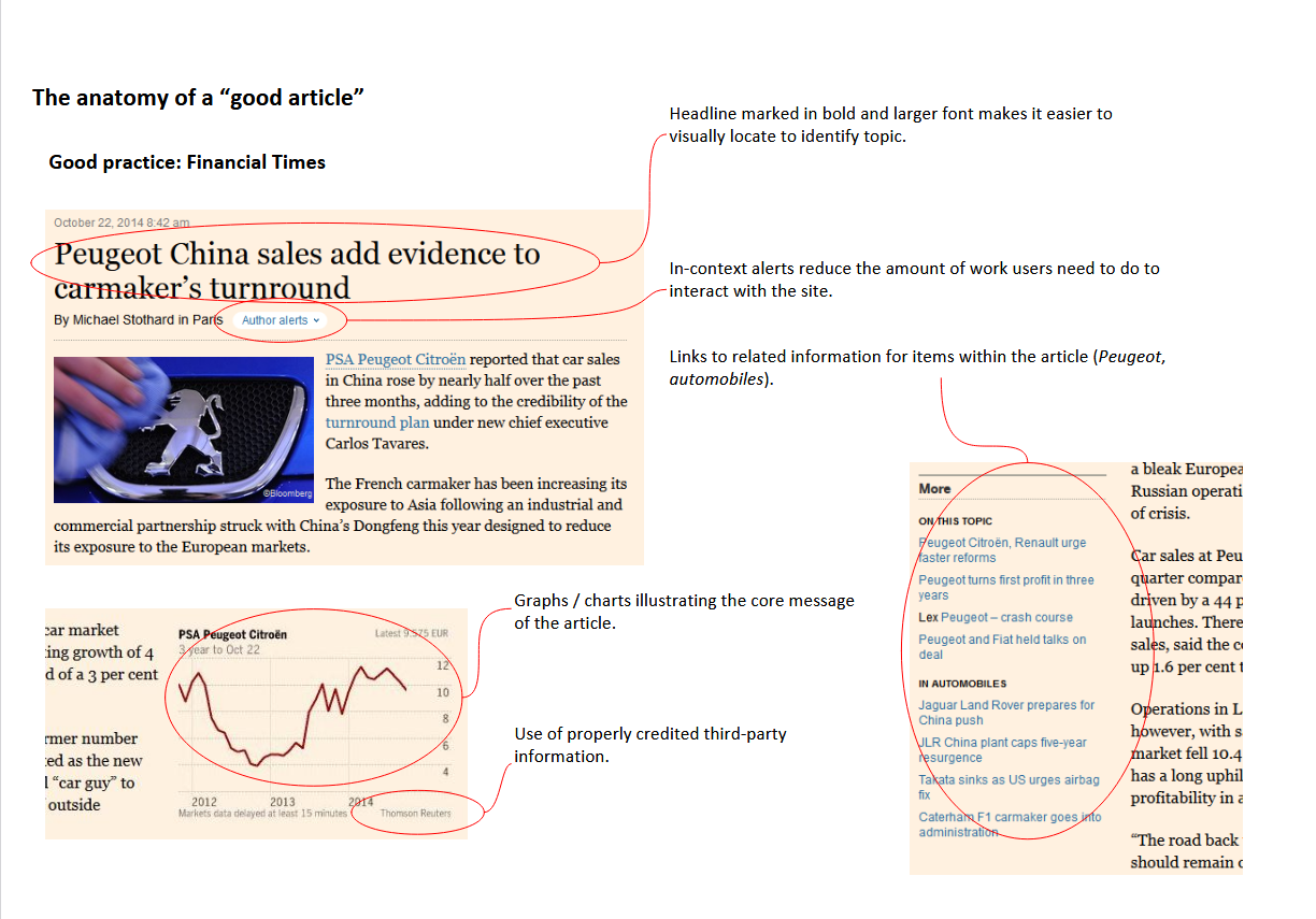
I examined competitors in this space to illustrate how good documents work by mapping user needs onto good existing designs. Included below are example screenshots from the BBC and Financial Times with comments.
The final picture shows a suggested design for the client with comments justifying the design decisions which originated in user research.
I worked with a graphic designer who created five different candidate page designs. After I discussed the user needs and justifications for design decisions, she created these for consideration using the constraints from user research that I'd provided.
The question remained of how all these different products should hang together in a way that made sense to users.
Outcomes: I had the basic design of the key page for all users. I now needed to make real the specifics of how people interacted with the system.
My challenge now was using every bit of information I had about the business, the client, the subject and the users and to bring it all together into a coherent, sensible and useful whole.
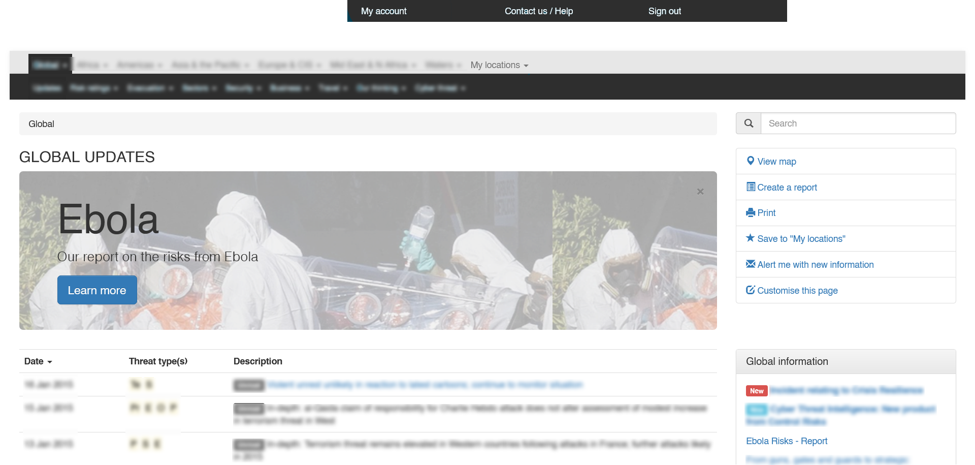
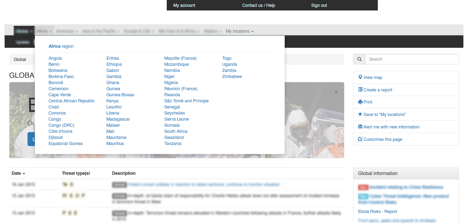
After intense creative thinking, the solution came. The one feature all users relied upon was location. All their actions were guided by where things were happening. Sure, other features played a role, but location was the primary feature.
There were multiple ways this could be defined: by region (i.e., continental), country, province or city but these could be handled hierarchically and lent themselves to a system navigation that made sense to users.
But this was hard to communicate to product-minded stakeholders and them being able to play with such a system would go further than just being shown.
I created a clickable prototype using HTML/CSS/JS (using the Bootstrap framework) with some demonstration pages to allow stakeholders to play with it. It also allowed quick heuristic analyses, usability testing and demonstration.
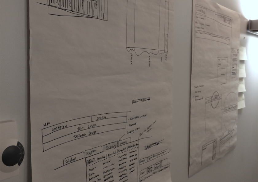
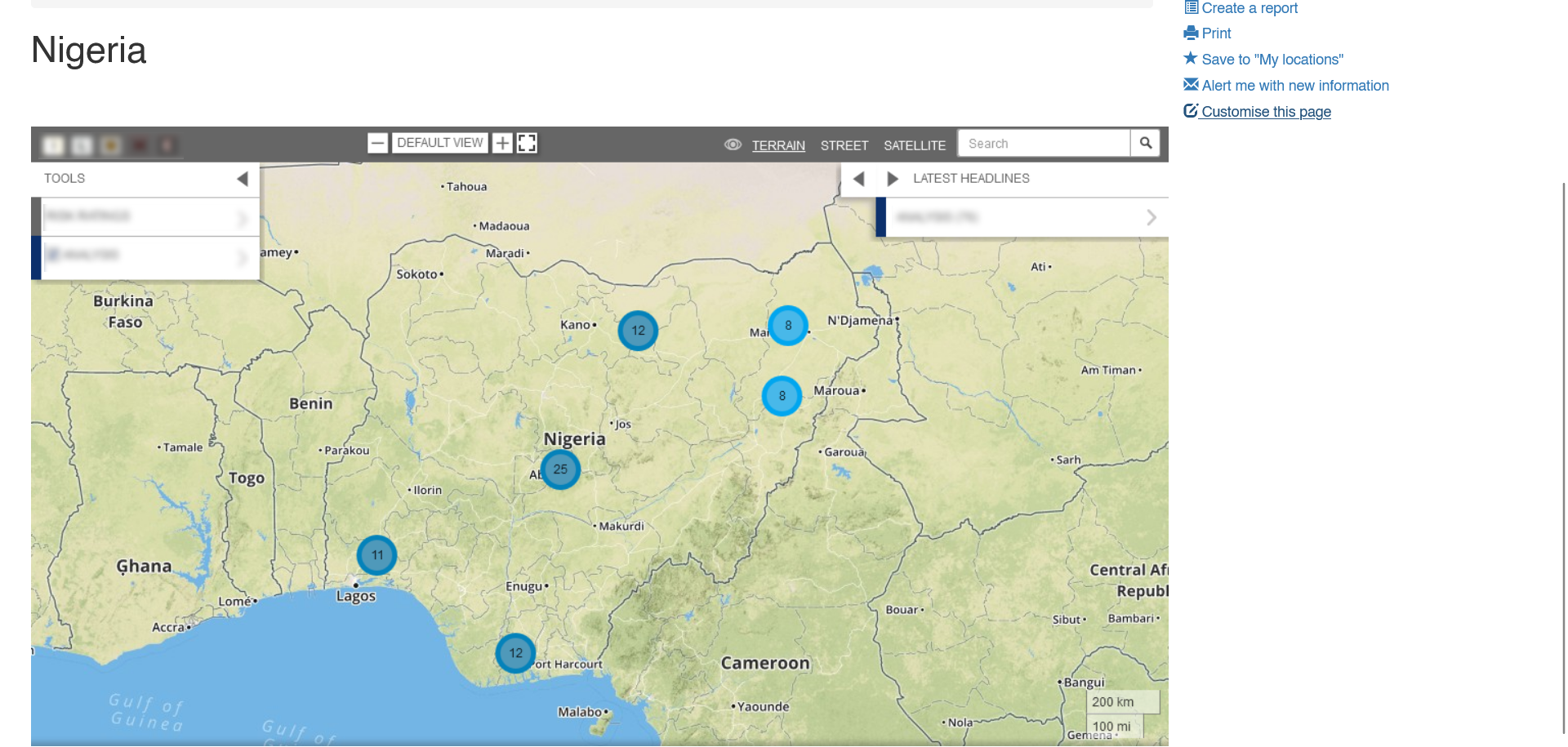
We used geography as navigation but the form of using it differed between users and their use cases. Some used maps, others used text, others bookmarks. The navigation system had to incorporate all these methods so functions allowed both text-based, map-based and user-defined locations to be located and specified. These are shown below but are obviously not final versions.
Outcomes: I had a model to show, demonstrate and test how the new interface worked, how users would navigate and what additional functionality could be provided.
It worked and I was almost there.
To finally turn the vision into reality, I created wireframes of the different templates and annotated them with sufficient detail for development.
Below shows a basic template wireframe, a faceted search facility and a map with hidden legend.
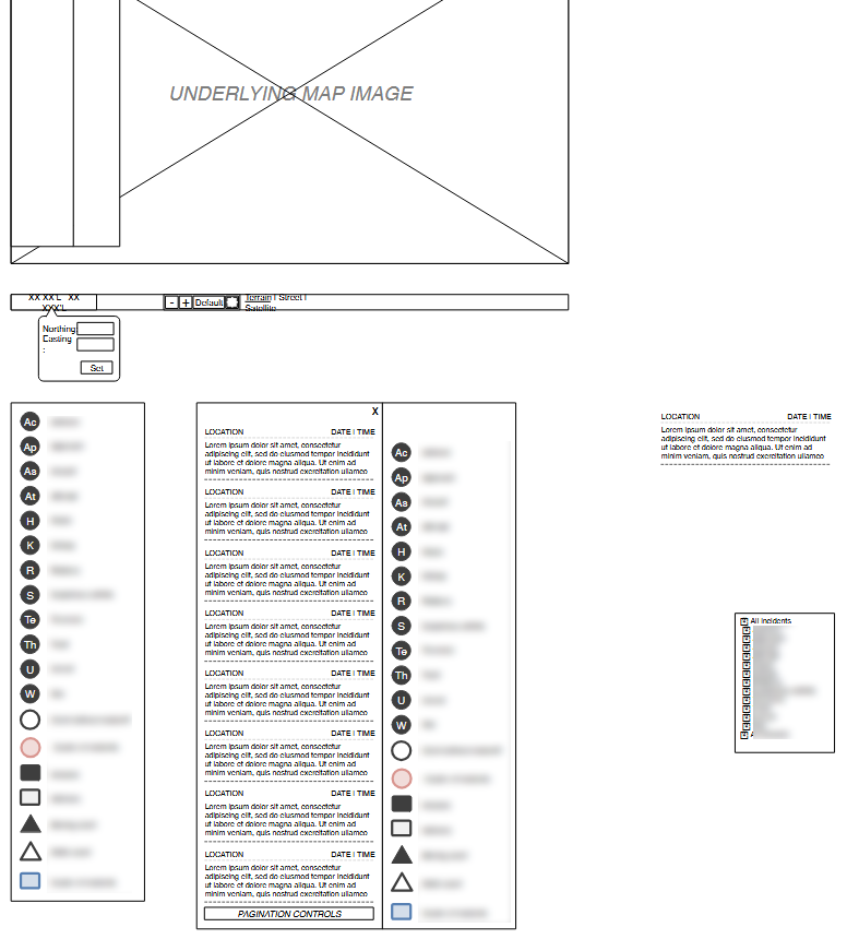
Outcomes: This gave sufficient documentation for the design to be built.
If you'd like to discuss working with me, contact me on jsmithtid@outlook.com.
LinkedIn: James Smith.